Using Power BI to Visualize Customer Saturation
Posted by Author, Canine & Equine Choreographer, Citizen AI Data Scientist, and Dynamics 365 Global Black Belt at Microsoft on
This week I was challenged to find a way for one of our customers to view how many customers they have by zip code, and compare it to the population within the area so that they can determine if they should accept new customer requests. Their customers are actually sales people, and they did not want to have more than one customer per 10000 people within the local zip code or surrounding area.
In this worked example I will show how I used the new suite of Power BI tools (Power Query, Power Pivot, Power View & Power Map) to allow them to analyze this information in a simple, and also very cool way.
Extracting the Customer Data
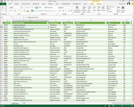
The first piece of information that we need is the current customers that we have within Dynamics AX.
How to do it…
To extract your customer data, follow these steps:
- I just exported that information directly out of Dynamics AX into Excel.
Getting the Population Data
The second set of data that I needed for this example is the population statistics by zip code.
Since the population data is not usually stored within Dynamics AX, I needed to find a source that could be incorporated into the customer data that we will be mapping in this example.
How to do it…
To get the population data, follow these steps:
-
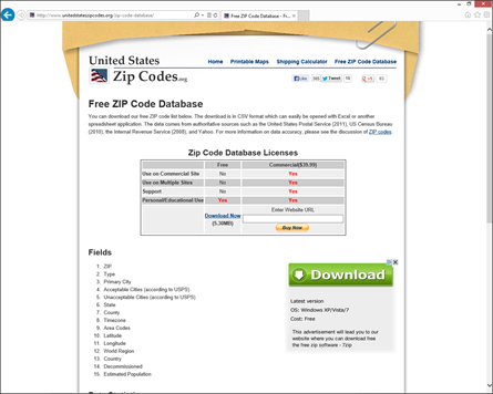
Fortunately, that information is not hard to find, and you can quickly download it from the United States Zip Codes website:
Importing the Census Data through Power Query
Since the Census data is in a CSV file, we need to import it into Excel so that we can link it to the customer data.
In this example we will show how you can use Power Query to create a linked query to the CSV file so that you just have to update the CSV each time there is an update.
How to do it…
To import the data, follow these steps:
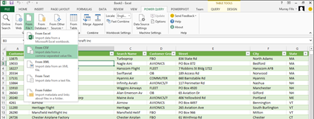
- To import the data using Power Query, just go to the POWER QUERY tab in Excel, and select the From CSV option from the From File dropdown in the Get Data group.
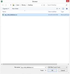
- Navigate to the zip code reference file that you downloaded from the United States Zip Codes website, and click OK.
- This will open up the CSV data as a query.
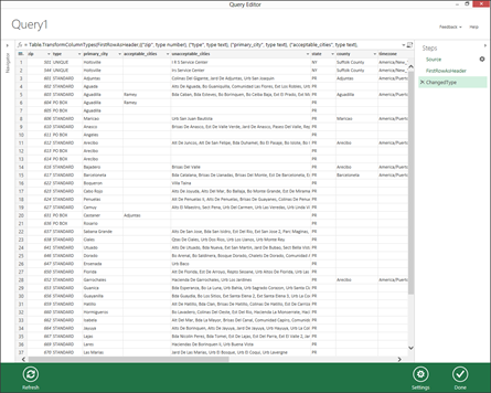
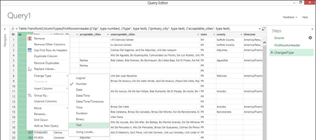
- The zip code is formatted as a number by default, and that means that the lower numbers do not have the preceding 0’s. Right mouse click on the zip column, and from the Change type sub menu, select the Text option to change the type to text.
- Now the zip code will show up in the correct format.
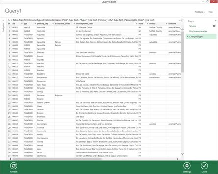
- Once this is done, click on the Done button to return to Excel.
How it Works…
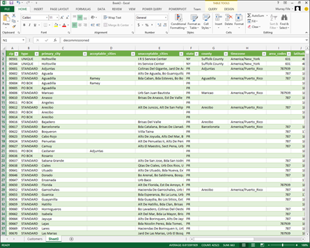
Now you will have all of the Zip Code data within an Excel worksheet.
Adding calculations to the Query
Since we want to compare the number of customers to a population ratio, we need to create a reportable field.
In this example we will show how you can create a new column in Excel for the maximum number of customers.
How to do it…
To add calculations to the query, follow these steps:
- Within the Census Data query, add a new column, and call it max_customers.

- Then within the first row of the query, add a formula that returns 1:10000 value based on the population of the zip code.

How it Works…
That will then populate all of the other rows.

Linking the Queries with Power Pivot
Since we have two sets of data – the customers and census – we need to relate them together so that they will filter together when we merge the data.
In this example we will show how to use Power Pivot to create a relation between the two sets of data.
How to do it…
To link the queries with Power Pivot, follow these steps:
- Select the Census Data worksheet data, and the select the Manage option from the Model Data group of the POWERPIVOT ribbon bar.

- This will open up the Power Pivot administration view.
- From the View group of the Home ribbon bar, select the Diagram View option to switch view modes.
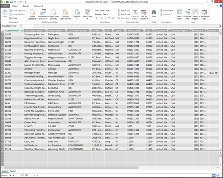
- This will allow you to see all of the queries that you have in your spreadsheet.
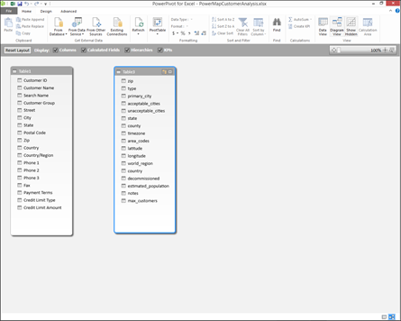
- Link the Customer and Census Data by Selecting the Zip code from the Customer data and dragging it over to the zip field in the Census data.
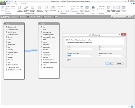
- Once you have done this you can close the Power Pivot administration view.
Mapping the Data with Power View
Now that we have the data, imported and linked, we can start visualizing the data.
In this first example, we will show how you can use Power View to analyze the data.
How to do it…
To map the data with Power View, follow these steps:
- To create a Power View view, click on the Power View button within the Reports group of the Insert ribbon bar.

- This will open up a Power View canvas with some of the fields already added to a simple table.
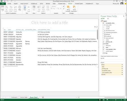
- Remove all of the fields except for zip and also add a title to the view.
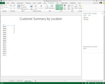
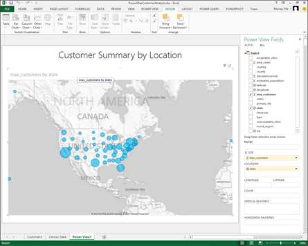
- Remove all of the fields from the default view, and add the state and max_customers to the dashboard. Then from the Switch Visualization group of the Design tab, click on the Map button.
How it Works…
This will now show you a suggested breakdown of customers by population of the state.
Adding Drill Downs to Power View Dashboards
For our example, we want to be able to see the suggested customer levels by zip code, but to show all of them initially would be far too much data.
In this example we will show how you can use drill downs within Power View to allow you to drill into data at your leisure.
How to do it…
To add drill downs to the dashboards, follow these steps:
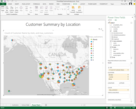
- Change the Power View configuration to include the county and zip in the locations field.
- Add the max_customers to the COLOR field so that we can visually identify the different population levels.
- Also, add the Customer Name to the Size field (we will see that in action later on).
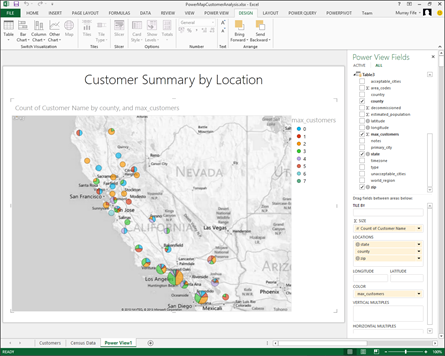
- This will show all of the states with pie slices for each of the different segregations.
How it Works…
If you hover over any of the pies you will be able to see the information that is associated with it.
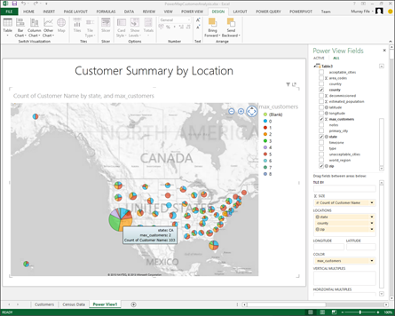
Double clicking on any of the States will drill you down to the county level.
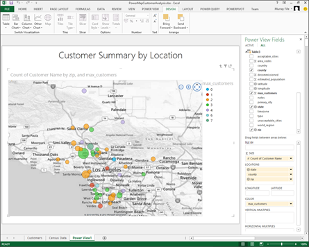
Clicking on the county will drill you down to the zip code level.
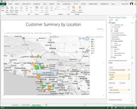
Hovering over any of the zip code bubbles will show you the number of customers, and the suggested level.
Adding Additional Data to the Power View Dashboard
To make the dashboard even more informative, you may want to add some additional data to the view.
In this example we will show how you can combine data on a dashboard that will be automatically filtered out.
How to do it…
To add additional data, follow these steps:
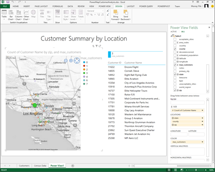
- Resize the map component of the dashboard, and add a new set of data that shows the max_customers field. Then from the Table button on the Switch Visualization group of the DESIGN tab, select the Card view.
- Then add another data view that shows the Customer ID and Customer Name as a Table.
How it Works…
Now when you select any of the zip codes, it will show you a summary of the maximum number of customers, and also a list of the customers in the area.
Mapping the Data with Power Map
Although Power View is cool, Power Map (a.k.a. GeoFlow) is even cooler.
In this example we will show you how you can use Power Map to visualize your customer breakdown.
How to do it…
To map the data with Power Map, follow these steps:
- To create a Power Map from the data within Excel, click on the Map menu button from the GeoFlow group of the Insert ribbon bar, and select the Launch Geoflow option.

- Then click on the New Tour button at the bottom of the dialog box to create a new map visualization.

- This will open up a new Power Map canvas.
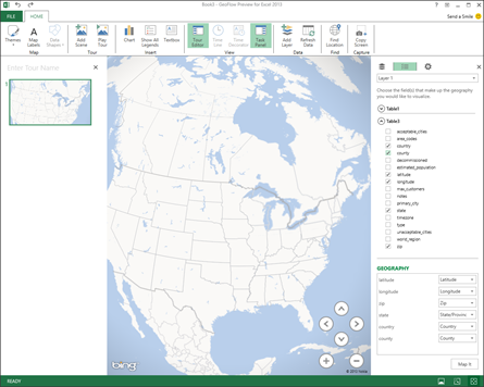
- From the Census Data on the right, click on the Country, State, County, Zip, Longitude and Latitude fields and click on the Map It button to make Power Map index them geographically.
How it Works…
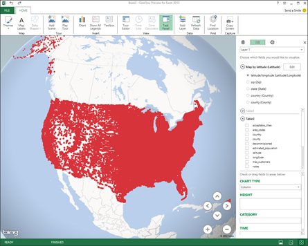
This will create your initial view with all of the zip codes mapped out for you.
Filtering Out Unnecessary Data
For our example, we just want to view the primary zip codes that have significant populations.
In this example I will show you how you can filter out the blank and negative values within the Power Map view.
How to do it…
To filter out the blank data, follow these steps:
- To filter out the view to just the major zip codes, click on the Settings icon (the cog) on the right hand panel.
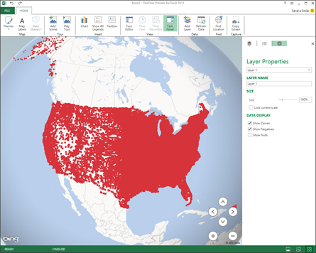
- Then uncheck the Show Zeros and Show Negatives options.

- Then add the max_customers to the height field in the map options.
How it Works…
This will clean up you map just a little.

Analyzing data within Power Map
Now that we have the Power Map designed, we can start using it to analyze our data.
In this example we will show how you can use the map to compare the suggested and actual values.
How to do it…
To analyze the data, follow these steps:
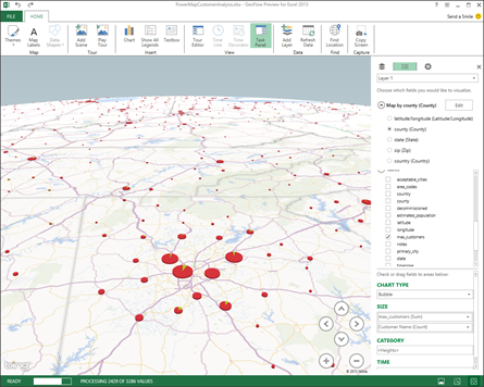
- Change the CHART TYPE from Column to Bubble. This will give us an easier way to view the data.
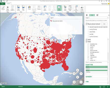
- Then from the Customer query, select the Customer Name and add it to the SIZE field.
How it Works…
This will allow us to see the two fields within the same bubble.
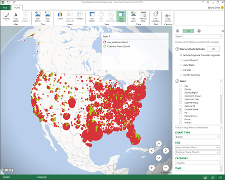
If you zoom into any zip code or region, you will be able to see all of the customers as a pie piece, and immediately see the ration of customers to the capacity of the area.
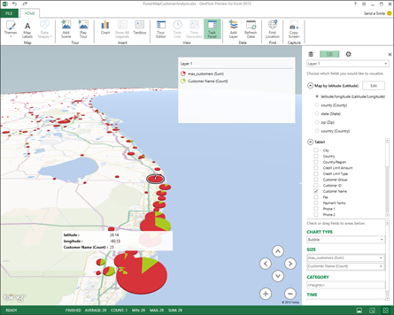
Very cool.
Searching for Locations
To zoom in on particular locations, you can use the search feature within Power Map.
In this example we will show how the search option works.
How to do it…
To search locations, follow these steps:
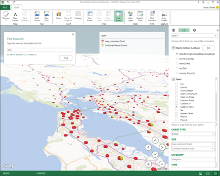
- To search for an address within Power Map click on the Find Location button within the Find group of the HOME ribbon bar.

How it Works…
When the search box is displayed, type in the address or location that you want to find, and the map will zoom straight to that location.
Viewing Data at different Levels
The second set of data that I needed for this example is the population statistics by zip code.
Since the population data is not usually stored within Dynamics AX, I needed to find a source that could be incorporated into the customer data that we will be mapping in this example.
How it Works…
To view the customer breakdown at the State level, just select the state option from the Map by.. selection.
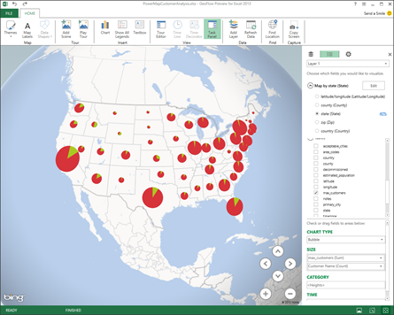
You can do exactly the same for the County as well.
Using Heat Maps to Visualize Data
Another way to visualize your data within Power Map is through heat maps.
In this example we will show how you can use the Heat Map option to view customer concentrations.
How to do it…
To use the heat maps, follow these steps:
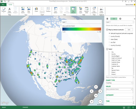
- To view the data as a heat map, just change the Chart Type to HeatMap.
How it Works…
Heat maps only allow you to visualize one field at a time. If you change the field from the max_customers to Customer Name then you will be able to see where the b=majority of your customers are located.
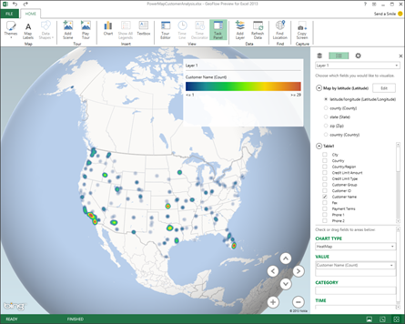
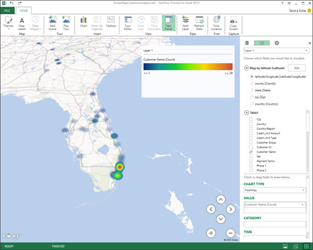
Zooming into the map areas will allow you to see concentrations at the state and zip code level as well.
Summary
This walkthrough showed how to use all of the Power BI products that are available within Excel to combine multiple data sources into one consistent view.
Once you have mastered the basics then there is so much more that you can do with Power BI. You might want to try:
- Adding web data sources for real time data integration
- Saving Power View reports to Power Pivot Galleries for everyone to view
- Incorporating the views that you create into Dynamics AX as a menu option for context sensitive reporting
The Power BI suite is very cool. Give it a try.
Share this post
- 0 comment
- Tags: Dynamics AX
0 comment

